In the fast-paced world of e-commerce, where technology and consumer preferences are constantly evolving, businesses are always on the lookout for innovative strategies to stay ahead. One such technological advantage that has been gaining momentum is the implementation of the T Layout in web design. This article explores the T Layout, an “out-of-the-box thinking” design approach that enhances user experience on mobile devices, and discusses how it can be leveraged to increase e-commerce revenue.
The Evolution of Web Design: A Shift to Mobile-First
The shift to mobile-first web design is a response to a clear trend: the increasing dominance of mobile devices in online shopping. More than ever, consumers are turning to their smartphones and tablets to browse and purchase products. This shift has necessitated a rethinking of web design principles, with a focus on mobile functionality, ease of navigation, and quick access to information.
What is the T Layout?
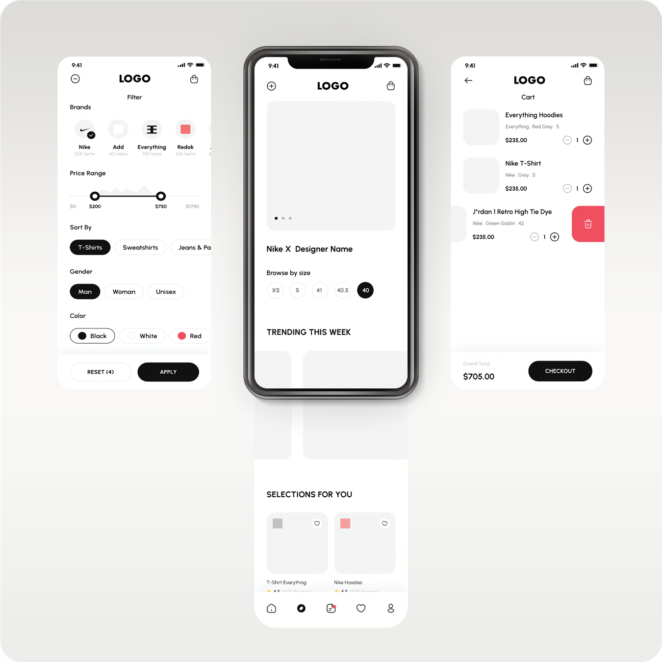
The T Layout is a novel web design concept that reimagines the structure of mobile web pages. It was first introduced in 2023 by E clothing marketplace and has since set a new standard for mobile web interfaces. This layout is characterized by its resemblance to the letter ‘T’, where a horizontally scrollable container is divided into three sections: a central section flanked by two utility sections on either side.
Central Section
The central section is the heart of the T Layout. It is the first section visible to users upon loading a page and contains the primary content relevant to the current URL. This strategic placement aligns with users’ expectations and provides an intuitive browsing experience.
Side Sections
The side sections, positioned to the left and right of the central section, serve as utility areas. These sections house navigation elements, user account information, and in the case of e-commerce sites, crucial functionalities like shopping cart and checkout processes. This design ensures that these essential features are easily accessible, improving the overall user experience.
Revolutionizing User Experience
The T Layout significantly enhances the mobile browsing experience by simplifying navigation. It reduces the average time it takes for users to access the mobile navigation menu or the cart summary, making it more efficient compared to traditional designs. This efficiency is especially evident in e-commerce websites, where quick access to product categories, cart, and checkout options can make a substantial difference in user engagement and sales conversions.
T Layout vs Traditional Layouts
Traditional mobile web designs often place navigation controls at the top of the screen, requiring users to stretch their thumbs uncomfortably or change grip to utilize both hands. The T Layout, with its swipe-friendly design, offers a more ergonomic alternative. It caters to the natural thumb movements of mobile users, making navigation effortless and reducing the physical strain associated with traditional layouts.
Customization and Flexibility
The T Layout is not a one-size-fits-all solution but as a concept offers significant flexibility and customization options. Web designers can modify the layout by adjusting the size of the side sections or even removing one of them. This adaptability makes it suitable for a wide range of web applications, from simple informational sites to complex e-commerce platforms.
Technical Implementation
From a technical standpoint, the T Layout is designed to be compatible with both server-side and client-side architectures. It involves a parent flexbox and horizontally overflowing containers, each spanning the entire width of the viewport. This technical framework ensures that the layout can be integrated seamlessly into existing e-commerce websites, enhancing the site’s performance, SEO, and user experience.
Impact on E-Commerce
For e-commerce businesses, the T Layout is particularly impactful. By improving the ease of navigation and access to key e-commerce features like product categories, shopping carts, and checkout processes, the layout directly influences the shopping experience. A streamlined, user-friendly interface can lead to increased customer engagement, reduced bounce rates, and higher conversion rates. In an industry where every second counts, the efficiency brought by the T Layout can translate into significant revenue growth.
Case Studies and Success Stories
Several e-commerce businesses have already adopted the T Layout, witnessing notable improvements in user engagement and sales. For instance, an online retailer specializing in fashion apparel observed a 20% increase in average session duration and a 15% uptick in conversion rates after implementing the T Layout. These figures underscore the layout’s potential in enhancing the shopping experience and boosting sales.
Overcoming Challenges
While the T Layout offers numerous benefits, its implementation is not without challenges. It requires a thoughtful approach to web design and a deep understanding of user behavior. Businesses must ensure that their content is effectively organized within the layout’s structure to maximize its potential. Additionally, continuous testing and optimization are key to adapting the layout to the evolving needs of users.
Web Design in E-Commerce: Looking Forward
The T Layout is more than just a trend; it might represent the future of web design in the e-commerce sector. As mobile devices continue to dominate online shopping, the need for innovative, mobile-centric design solutions like the T Layout will only grow. E-commerce businesses that embrace this trend will position themselves for success in an increasingly competitive digital marketplace.
The T Layout is a transformative web design concept that offers e-commerce businesses a powerful tool to enhance mobile user experience and increase revenue. By providing an intuitive, user-friendly interface, it not only improves user engagement but also drives sales. As the digital landscape evolves, adopting such innovative design concepts will be crucial for e-commerce businesses looking to thrive in the competitive online market.