How are Area Charts Useful for Data Analysis?

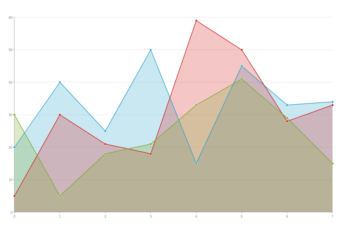
Area charts are a great way to compare data sets. An area chart is used to display changes in data over time. The area between the lines on an area chart represents the magnitude of the data at a given point in time. The height of the area is proportional to the value at that point. So, how are area charts useful for data analysis? Keep reading to learn more.
What are area charts?

So, what is an area chart? Area charts are used to display changes in data over time. The area between the lines on an area chart represents the cumulative total of the data points plotted on the chart. There are three types of area charts: stacked area, 100% stacked area, and horizontal bar.
A stacked area chart displays data as a stack of rectangles, with each rectangle representing a category or series and its height proportional to the value for that series. A 100% stacked area chart is similar to a stacked area chart, but instead of each rectangle being sized relative to its contribution to the total, they are all sized equally so that the entire diagram is filled. This can be useful when you want to compare two or more series against one another and see their relative proportions.
A horizontal bar chart displays data as a set of bars, where each bar represents a category or series, and its width is proportional to the value for that series. Bar charts can be either vertical or horizontal, depending on what orientation will make it easiest to compare the values in different categories.
How are area charts useful?
Area charts can be used to compare and contrast changes in data over time. They are particularly useful in business because they can help to track progress and performance against specific goals or targets. Additionally, area charts can be used to identify patterns and trends in data. This information can then be used to make informed business decisions.
One of the biggest benefits of using area charts is that they can help track progress and performance against specific goals or targets. For example, if a business wants to track how well they are doing in terms of meeting sales goals, it can use an area chart to compare its current sales figures against its target sales figures. This can help to identify whether they are on track to meet their goals or not.
Another benefit of area charts is that they can be used to identify patterns and trends in data. This can be particularly useful for businesses, as it can help them make informed decisions about where to allocate their resources. For example, if a business notices that its sales are increasing in a certain region, it may want to allocate more resources to that region in order to capitalize on the trend. Overall, area charts are a powerful tool that businesses can use to track progress and performance, identify patterns and trends, and make informed decisions.
How do you read an area chart?
An area chart is a data visualization tool used to illustrate where the area of each section is proportional to the magnitude of the data. It is used to display how a particular value changes over time or how two or more values compare. To read an area chart, you first need to identify the horizontal and vertical axes. The horizontal axis shows the time period or categorical values, while the vertical axis shows the corresponding measurement or values. The sections of the area chart are then created by connecting the data points with lines.
To determine the magnitude of each section, you need to look at the value on the vertical axis and find the corresponding point on the horizontal axis. The area of the section between the two points is then proportional to the value on the vertical axis.
Area Charts are important for data analysis because they provide a visual representation of how a particular statistic changes over time. This can be helpful in understanding how a particular trend is developing or in evaluating the overall progress of a project.


