(Want to have a high-converting landing page? Learn five design elements to take your landing page to the next level. )
A landing page is a page whose primary job is to boost conversion rates and help you reach your marketing goals. This includes your homepage or any other made for any other purpose to advertise your business.
However, creating a landing page that converts is easier said than done. An average-looking landing page can become a high-converting one only when it has the right design elements. While it may not be exactly rocket science to crack the correct formula, it sure takes some work. Here are 5 key design elements that a web design company would place on a landing page to help it perform as per expectations.
1 – Think about the headline
The headline on your landing page immediately catches the audience’s attention as soon as they come across it. Make it count by making it short but catchy. The headline should entice them to check out the rest of your landing page and make them excited about the content they are going to read.
According to veterans of branding agencies, the best way to create impactful headlines is by understanding who is your target audience and what they want to see. Check out what your competitors are putting on their landing pages, create your own headlines, and run A/B testing to find out which performs better. Always keep the headlines simple, so they stick.
2 – The visual assets should be killer
Creative agencies notice better-performing landing pages when appropriate visual elements are incorporated. After all, a human brain responds to images better than lengthy texts. Naturally, a landing page filled with interesting images is bound to capture their attention. The oft-repeated slogan, ‘Show, rather than tell’, is at its finest when you look at a landing page.
But how do you determine whether the visuals you plan to upload on the page will get the desired reaction?
First up, you cannot compromise on the quality of images. You can even use smartphone images as long as the quality is not diluted. You also need to add images that support what you are selling through the landing page. For instance, if you are selling a product, the images should show that particular product from various angles. Steer clear from using stock images you can find online — the visitor wants to see what you are selling. If your landing page is to showcase the functionality of your platform, don’t forget to add relevant screenshots to give a taste of what it is like to your audience.
Your landing page should also have a hero image which is the first visual asset that visitors will notice once they arrive at your landing page. This image should complement the overall content of the landing page — for instance, if you are selling hair care products through your eCommerce platform, you can have an image of someone applying the products and displaying their healthy hair.
Lastly, as a design element, check whether images can replace the need for adding more text. Lengthy texts can be tedious to read and put off the user. If you can substitute text with images, your landing page is bound to perform better.
3 – Check whether your call to action is powerful
Everything that you add on the landing page boils down to only this — whether visitors are converting into paying customers.
The single most powerful tool to make that happen is the call to action button. This is what nudges your audience to take the desired action. Adding vague words such as Submit or Click now cannot get you the desired conversion as it doesn’t convince the users. It is not sufficient for your audience to come across such words because it doesn’t give them the necessary information about what happens next.
That’s why, your call to action button should present the consequences — instead of Submit, you can say ‘download this free guide’ or ‘sign up for early access. Providing them instant answers about what happens next through the call to action increases the chances of getting more conversions. You can get in touch with an experienced web design Tampa company to better understand what will work for your website and what will not.
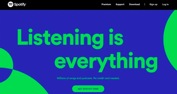
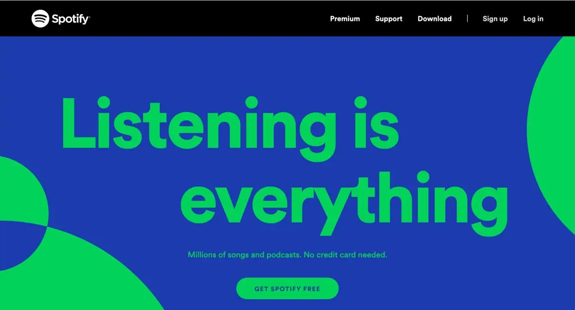
Another hot tip to increase the effectiveness of your call to action is by adding microcopy directly below or above the main sign. Microcopy goes a long way in minimizing the potential worries of a user (will you spam them once they sign up?), makes users more excited about what’s to come, and increases the urgency of taking action right away. Take inspiration from Spotify and the clever microcopy it adds on its landing pages to boost sign-ups:
4 – Social proof is a non-negotiable
When you look at the anatomy of a landing page, social proof is one of the key design elements. What others think about your product or service has a huge impact on drawing in more traffic and getting them to convert. Your landing page advertising a sleek billing software can only get desired sales when the user discovers other companies benefiting from it.
You can add social proof in a number of ways. Whether it is video interviews or direct quotes, or publishing full-length case studies — there’s a lot you to experiment with. However, you cannot fake your social proof, as that impacts your credibility as a business.
5 – Layout and structure matter more than you think
Landing pages built with a balanced structure can dramatically improve conversions. A professional web designer knows how to place various elements on your landing page to make it look clutter-free and aesthetically appealing. Choosing the right fonts (both style and size), choosing a proper color scheme that ties in with the brand identity, adding enough whitespace, and placing bite-sized texts — stylistic changes such as these can make a massive difference to the conversion rates. After all, you have to engage your visitors to get them to convert, and how you structure the information plays a crucial role in ensuring that.
You also need to have a clear interface on your landing page. This includes adding a headline that sums up the product/service for the user, easy-to-follow graphics, and succinct text that communicates the benefits of what you are selling. It shouldn’t be too busy with too many elements or improper font sizes that leave the audience confused.
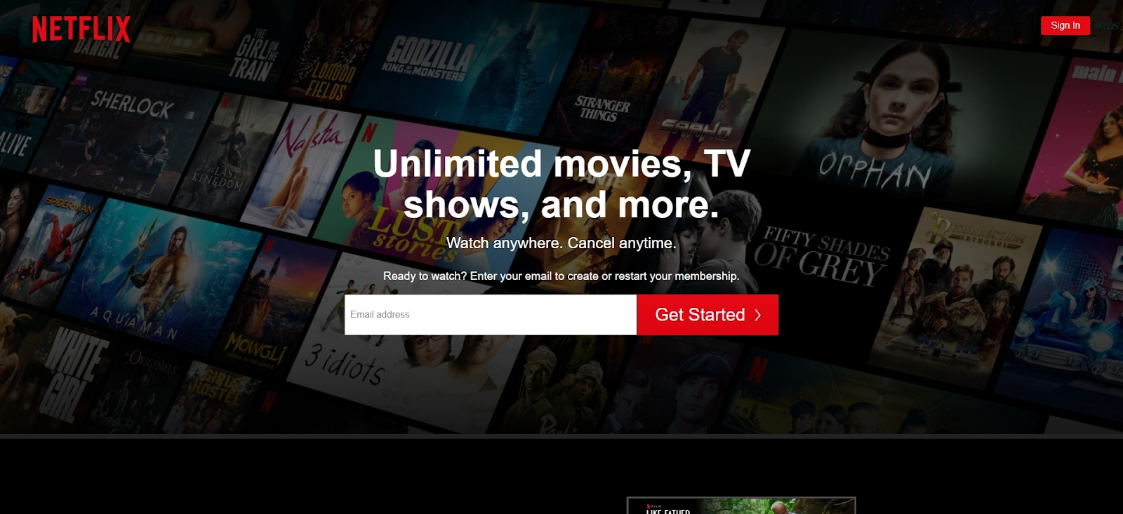
Consider the landing page of Netflix, as an example. The minimal and basic design conveys it all without overloading the visitor in any manner. It has a clear and actionable copy, a powerful CTA, and the perfect layout, which is visually pleasing.
Compare it with this landing page from Wise.
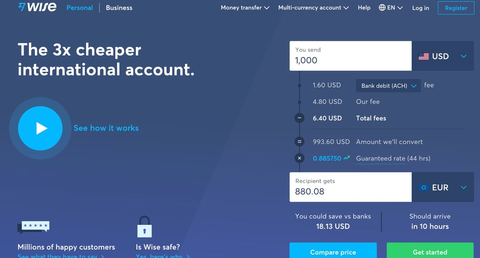
Even though the landing page contains key information about the business, it appears too busy. It also has too many dropdown buttons in an extremely small font which might make navigation challenging.
The bottom line is striking the perfect balance between presenting all the necessary information for your audience to get them to convert and choosing the right manner of presentation to keep them engaged.
Conclusion
To sum up, your landing page should convey to potential visitors that you are worth their time. Right off the bat, you want to come across as a business that has something valuable to offer to ease the pain points of the prospects.
Building a high-converting landing page requires careful consideration. And you can achieve your goals easily by onboarding the right professionals! Get in touch with our team at SPINX, a web development agency that can provide inputs about the right design elements to help your landing page shine.
Author Bio:Brijesh Jakharia co-founded SPINX Digital in 2005 and takes great pride in crafting web and mobile marketing solutions for mid-market businesses to enterprises. Marketing is his passion, and the thrill to build a brand from the ground up has helped him craft successful brand stories for world-class clients. While not at work, he loves to spend his time on research and reading digital content stories.