Web design is not just a beautiful combination of pictures and colors. When creating web pages, UX/UI specialists think through the meaningful details that allow them to influence user behavior. To achieve this goal and captivate website visitors, designers resort to proven psychological laws. For example, they can use the following five principles of psychology in UX design to encourage customers to take action.
Fitts’s law in web design: shortening the client’s path to CTA elements
Fitts’s law was discovered in the 1950s. With its help, psychologist Paul Fitts demonstrated the complexity of the target selection problem. The scientist found that the farther from a starting point and the smaller a target or an object is, the more difficult it is to reach it. Here is the essence of the law: “the time required to rapidly move to a target area is a function of the ratio between the distance to the target and the width of the target”. Let’s translate it into the language of design: the farther from the cursor a CTA element is (for example, the “Buy” button), the more difficult it is to find and click it.
Following this principle of psychology in UX design, specialists try to arrange web page elements in the following way:
- a CTA element must be located not far from the cursor, in the visibility zone;
- a CTA element must be visually larger and highlighted.
Fitts’s law teaches UX designers how to shorten the customer’s path to a goal. It is used in web design to:
- properly place a search button on a page. By placing it near the cursor, designers help users quickly find what they need on a site.
- optimize a menu. For example, designers needn’t include all categories in the menu section. They can use the “Additional” option or drop-down lists for each category. So, visitors will navigate a site and search for the desired product.
- correctly calculate the size of CTA elements. See the formula below to get a mathematical description of Fitts’s law:

Based on this formula, UX designers calculate the exact dimensions of elements. This is how they make buttons bigger so that they stand out and are easy to click. Capturing a larger target requires less precision.
You can see the successful application design of Fitts’s law in web design on the HubSpot website:

Representativeness heuristic in UX design: helping the client make a decision faster
Every day, the average adult has to make up to 35,000 decisions, from simple “What to eat for breakfast” and “How to dress for the office” to more complex tasks related to their profession and personal life. The human brain is constantly at work, choosing between several solutions, the one that is optimal for a person. But human energy is not infinite, and everyone has their own “decision fatigue” limit.
When visiting a website, users face a large information flow. And they need to spend even more energy studying available goods, comparing several products, weighing the pros and cons, and finally making a purchase decision. A UX designer must help site visitors so that they don’t get confused with loads of information. Otherwise, they will simply get tired and abandon the cart. The representativeness heuristic helps to solve this issue.
The essence of this psychological method is as follows: a person evaluates the probability of an event by comparing it with a stereotype. For example, an observer sees a man with long hair, wearing a black leather jacket and carrying a guitar. They will think it’s a rock musician, not a circus performer. A stereotypical image of a certain group of people is deeply rooted in their subconsciousness.
Why is the representativeness heuristic useful in UX design? Because users believe that important information in a newspaper, magazine, book, or website is highlighted in color, size, or font. This means that CTA elements or other page objects that a design engineer wants to draw attention to should be highlighted. For example, you can color the “Buy” button red when all the others are green. Giving a product a “Top Selling” tag will make visitors want to buy it. You can highlight promotional items so that customers can take advantage of a discount.
Alibaba.com designers skillfully use the representativeness heuristic offering users products with the lowest prices first:

Serial positioning: place information in a memorable way
In the 1960s, Professor B. B. Murdock conducted an experiment. The scientist invited a group of people to memorize words from lists of different lengths, from 10 to 40 words. The researcher found that people memorize better only the first and last words from the list. Murdock called this phenomenon the Primacy effect and the Recency effect.
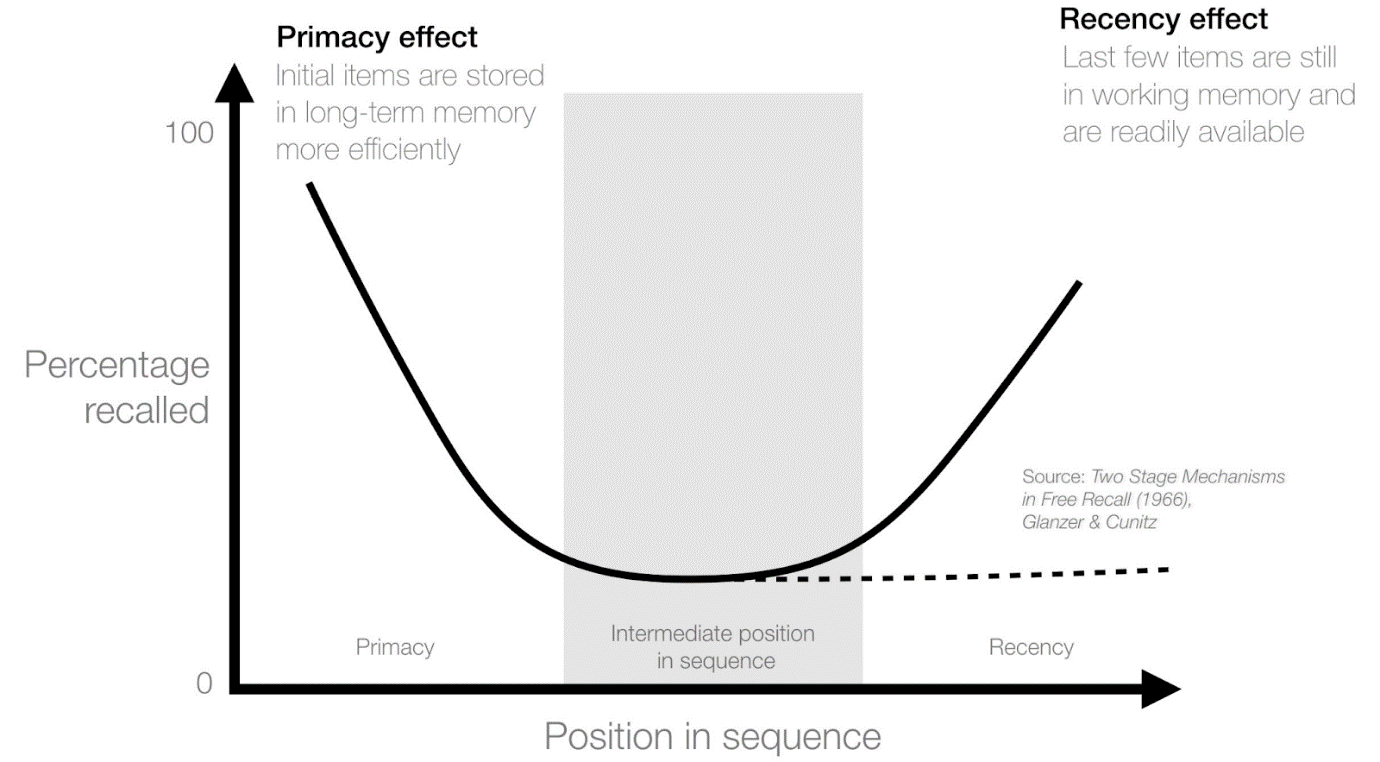
Knowing this feature of human memory, designers try to place important theses at the beginning and the end of the text on a web page. The brain remembers the first phrases because it considers them primary, important information. It also retains the final data because this is the last information received.
According to this principle, you should place priority links at the beginning and the end of a list. Place important tabs in a horizontal menu on the left and the right. This way you’ll manage to draw the attention of users to the primary information on a page and sort the data.
Bookswagon.com, a major online bookstore, uses serial positioning to focus visitors on important sections (“New Arrivals” and “Request a Book”).

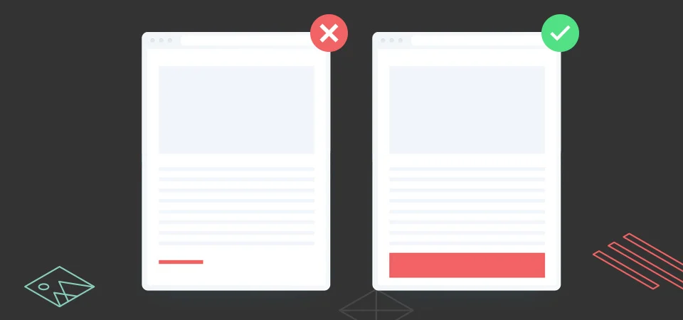
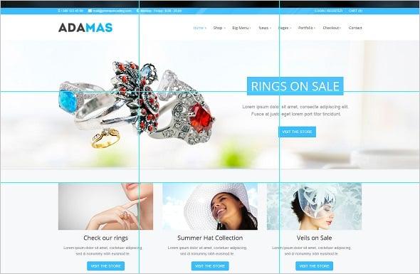
The rule of thirds in design: focus users on the right objects
The emergence of the rule of thirds in art is associated with Remarks on Rural Scenery, the work of the engraver John Thomas Smith. In the modern sense, this rule means a web page layout with the entire area divided into nine parts by a grid of three horizontal and three vertical lines. At the intersection of all lines inside an area, one can visually mark the quadrilateral and its corners with focal points.

People tend to focus on the points of intersection, so these locations are the most important. Designers who want to avoid mess and draw attention to relevant details place their target and CTA elements in these areas. People are more likely to complete purposive actions and click the “Add to cart”, “Buy” or “Order” button if they are located at these points.
For example, Adamas used the rule of thirds in design to draw the attention of customers to a sale of rings:
Gaze following: draw visitors’ attention to the priority elements of a page
Have you ever seen objects, parts of which reminded you of a face? Just like in the picture below:

There is a scientific explanation for this phenomenon called face pareidolia. It is mainly associated with the primitive desire of man to survive in the wild and decipher social signals. Scientists have noted another interesting phenomenon: people also tend to follow the gaze of any person. This is called gaze following. Take a look at the picture below and you will unconsciously look in the same direction as the lady in it.

UX design companies use this simple psychological trick to attract website visitors to individual blocks. Researchers have found that users focus on texts, elements, and objects to which the gaze of a person in a photo is directed.
Thermal imagers recorded the movement of the gaze of users of a commercial site. When a baby looked at them directly, visitors would rather focus on the child than on the text.

When the site offered an alternative version of the page (with a baby looking at a product), the focus of customers also changed. In the picture below, you can see that people began to look at both the child and the product.
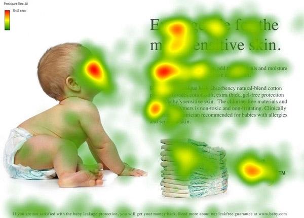
Knowing this principle of psychology in UX design, specialists place images of people on a site in such a way as to indicate CTA elements. Such a seemingly minor point can considerably increase CTR.
Conclusion
To build a successful relationship between clients and a business through a website, a designer must not only be creative but also understand the basics of psychology in UX design. Knowing what attracts people the most and how to make them perform target actions, specialists correctly arrange objects on web pages thus simplifying user experience. As UX consultant Paul Boag pointed out, to be a great designer, you need to look a little deeper into how people think and act.